There's a lot of pressure when your client has managed and designed six of her own home remodels over the last 40 years...
Even more pressure when she has a laundry list of things she strongly dislikes (hates): Stainless steel, fingerprints, all-white kitchens, deep sinks, granite, etc. I'm always up for a challenge though and I'm so happy I took this one on.
Though this condo on the Columbia River had been renovated in the last few years, it wasn't to my client's liking and she knew from the moment she purchased it that she wanted to redo the kitchen as soon as possible. Though dark and outdated, the cabinetry was in good condition and the layout was functional. Luckily, budget and timeline-wise, this was not going to be a total tear out.
The cabinetry AND the laminate flooring had an orange-y hue to it and the granite countertops were dark and lackluster. A monster of a fridge overtook the space...plus, it was the S-words...STAINLESS STEEL.
The kitchen was located right at the entry of the condo and was open on one side to the main living area and dining room. Basically, the kitchen set the tone for the entire home and was visible no matter what so it needed to shine.
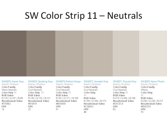
My client had previously painted the rest of the condo in "Perfect Greige" by Sherwin Williams and she loved it. Being that the home was small, I didn't want to make visual "breaks" in the space by adding too many different colors. We decided to paint the upper cabinets that same color and then jump a few shades darker for the base cabinets with "Garret Gray".
Additionally, because of her dislike of stainless steel, I researched appliances that would meet her expectations and my vision for the space. GE Slate Appliances to the rescue!! These gorgeous, stone-inspired (and smudge proof) appliances were the perfect solution we were looking for. AND, like a match made in Heaven, they coordinated perfectly with the lower cabinet color I had chosen.
The main goal I had for this kitchen was to make it blend into the rest of the home as much as possible. With too many colors in a confined area, there is a risk that they could divide the space, thus making it seem choppy and small. By using a color palette that continued through the condo and appliances that closely matched the cabinetry, the space was cohesive.
My VERY favorite component of the kitchen remodel, though, came in the form of countertops. An incredibly beautiful AND durable material called Dekton was a fantastic solution and alternative to granite or quartz with unmatched durability. In a suede finish, it has the movement and veining found in marble without the upkeep. I wanted to keep petting them after install...so smooth and luxurious looking and feeling!
When I did my final visit and took the "After" pictures, my client told me that I had helped her achieve every single thing she was looking for and she wouldn't change a thing. Happy client equals happy Carrie. :)
What do you think?!? Pretty dramatic change, isn't it? The power of a cosmetic remodel never ceases to amaze me!
xoxo,
Carrie


